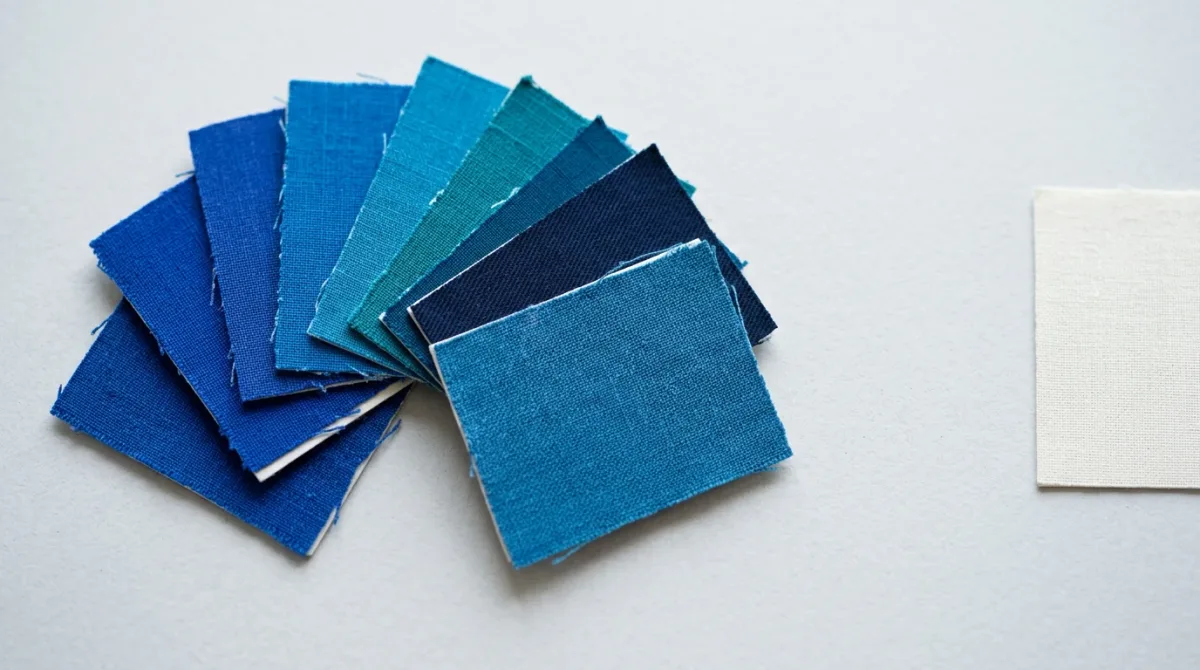
A season's color is named by a small number of commercial forecasting bodies, and it is named early. WGSN and Coloro published Luminous Blue (125—28—38) as Colour of the Year 2027 on 29 April 2025, roughly two years ahead of the season it describes. Pantone named PANTONE 11-4201 Cloud Dancer for 2026 on 4 December 2025. The two houses run on different clocks, and they are not naming the same thing.
Who actually names a season's color?
No single body does. The forecasts that circulate most widely come from two separate operations with different products: Pantone, through its Pantone Color Institute, and WGSN in partnership with the color system company Coloro. Pantone issues one Color of the Year per calendar year. WGSN and Coloro issue a Colour of the Year plus four supporting Key Colours per season.
The distinction matters more than it sounds. Coloro's published season list carries Transformative Teal (092—37—14) for A/W 26/27, Luminous Blue for both S/S 27 and A/W 27/28, and Radiant Earth (017—42—31) for S/S 28 — a rolling schedule of five colors per season, coded to a numeric system rather than named alone.
Pantone's calendar-year designation is a different instrument. It arrives once, in December, for the year that follows, and it is written for a broad consumer and brand audience rather than for a product-development calendar. Reading one against the other as a disagreement mistakes two different release schedules for a dispute.
How far ahead is the call made?
Two years, in the WGSN and Coloro case, and the companies say so plainly. Coloro's description of the partnership states that WGSN "harnesses their qualitative and quantitative data to forecast the Color of the Year and accompanying Key Colors two years in advance using Coloro's innovative suite of tools." The 2027 forecast was published in April 2025.
That lead time is not arbitrary. It is roughly the interval a textile supply chain needs to move from a dye decision to a garment on a rail — yarn sourcing, lab dips, sampling, production. A color named for spring 2027 has to be specified while spring 2026 is still being sewn.
Pantone's horizon is shorter and its announcement is closer to the year it names: Cloud Dancer was announced on 4 December 2025 for 2026. The practical consequence is that Pantone's color reaches consumers as a message about a year already beginning, while the WGSN and Coloro forecast reaches manufacturers as an instruction about a season not yet designed.
What goes into the decision?
WGSN has published an account of its own process, and it is a committee process rather than an intuition. According to the company, the seasonal forecast is assembled at what it calls a "dynamic, seasonal Global Colour Workshop" — a three-day gathering where, in WGSN's words, "WGSN's industry experts from across the world" pool regional research.
The inputs WGSN names are specific. Experts examine "aesthetic directions, consumer data and regional insights" through the company's STEPIC framework and an analysis of consumer emotions. Candidate colors are then tested against Coloro's Toolbox, which the company puts at more than 3,500 swatches, and its Colour Feasibility Intelligence tool, which checks whether a shade holds across different substrates and light sources.
That last step is the least glamorous and the most consequential. A color that cannot be achieved economically in cotton, in polyester and in leather is not a forecast; it is a swatch. WGSN states an accuracy rate of 93% for the process — a figure published by the company about its own work, and one no independent audit is cited for.
Pantone's published material sets out reasoning rather than method. Leatrice Eiseman, executive director of the Pantone Color Institute, framed the 2026 choice against noise: "The cacophony that surrounds us has become overwhelming, making it harder to hear the voices of our inner selves." Laurie Pressman, the institute's vice president, described "a transitional time where people are seeking truth, possibility, and a new way of living."
Where do the forecasts diverge?
They diverge on temperature, on horizon and on what a "color of the year" is for. Pantone's 2026 selection is an off-white; NPR reported on 4 December 2025 that it was the first time the company had chosen white for the designation. Coloro's schedule for the overlapping seasons runs to saturated blues and teals.
Neither position is a rebuttal of the other, because the two are not forecasting the same interval or the same audience — and neither company has been reported as revising its call. Reported side by side, the picture is a difference of instrument, not a contradiction resolved in either direction.
| Forecaster | Color named | Horizon | Published |
|---|---|---|---|
| Pantone Color Institute | PANTONE 11-4201 Cloud Dancer | Calendar year 2026 | 4 December 2025 |
| WGSN × Coloro | Transformative Teal (092—37—14) | A/W 26/27 | Listed by Coloro |
| WGSN × Coloro | Luminous Blue (125—28—38) | S/S 27 and A/W 27/28 | 29 April 2025 |
| WGSN × Coloro | Radiant Earth (017—42—31) | S/S 28 | Listed by Coloro |
What does a named color actually change?
It changes what gets manufactured. NPR reported that Cloud Dancer would appear on products from Motorola, Command, Post-it Notes, Joybird and Play-Doh, and that Pantone acknowledges named colors typically increase in popularity after the announcement. A forecast that arrives with licensing partners attached is partly a description and partly a cause.
The seasonal forecasts work on the same principle at an earlier stage. WGSN and Coloro's S/S 27 Key Colours — Energy Orange (018—57—34), Pop Pink (151—73—22), Meadowland Green (050—61—19) and Clay (014—60—13) — are sold to subscribers who then specify dyes against them.
Each color is published with a stated driver. Clare Smith, senior colour strategist at WGSN, described Luminous Blue as "both mysterious and eccentric, with versatility and a broad appeal that will resonate from occasionwear to active." The company gave interconnectedness as the defining 2027 theme.
How old is this practice?
Older than either company. The Textile Color Card Association of the United States was established on 19 February 1915, according to the finding aid for its records at the Hagley Museum and Library, and its formation is attributed there to American textile makers losing access to European fashion information during the First World War.
The association issued seasonal color cards twice a year, for spring/summer and autumn/winter, alongside a Standard Color Reference of America covering shades with sustained demand. Its records, held at Hagley, run from 1915 to 1983 and document what the finding aid calls the pre-season color selection process. The organization later expanded beyond textiles into government, military, plastics, automotive and entertainment work.
The structure has barely changed in a century: a committee, a season ahead of the market, a physical card. What changed is the tooling and the lead time. The card became a coded swatch, and the season became two years out.
What should a reader take from a color forecast?
That it is a commercial expectation with a named author and a stated horizon, not a fact about the future. Every color above is traceable to a company that publishes it, a code, and a date — and every one of them is a bet placed early enough to shape the supply that will later be read as proof the bet was right.
The useful question is never whether the color arrives. It is who named it, for when, and who had already ordered the dye. Pantone's own announcement and NPR's report on the reception it met answer both halves.
For a related culture perspective, read How a Hue Becomes 'The Color of the Year,' Explained.