A season's color palette is built roughly twenty-four months before it reaches a shop floor, through a chain that runs from macro trend research to dyestuff chemistry: agencies and color organizations research the mood, international color bodies harmonize their seasonal directions, brands translate the results into weighted palettes, and mills dye sample lots that either work in production or do not. The lead time is not bureaucracy; it is the physical speed of thread. Yarn must be spun and dyed, fabric woven and finished, and garments cut and shipped — and every step upstream of the shop floor needs the color decision before it can start.
By the time a customer sees a season's colors on a rail, the decisions behind them were made when that season was still an abstraction — a target quarter, a hypothesis about mood, a set of laboratory dips on card. Understanding that sequence explains much of how the industry behaves: why announcements cluster in specific months, why brands seem to agree on a mood before the public does, and why a color can feel everywhere at once when it finally arrives — it was scheduled to, two years earlier.
Where does a palette actually begin?
In long-range research, not in fashion. Color organizations start from the same macro inputs agencies publish as drivers: economic mood, technology headlines, social attitudes, sustainability pressures — the reasoning being that color responds to how people feel before it responds to what is selling. Specialist color houses and institutes, from the Pantone Color Institute to independent consultancies, publish seasonal directions from this research, each arguing a palette story: which neutrals are fading, which accent hues are rising, which temperature the season's neutrals should carry.
The international layer comes next. InterColor — the international color group whose member organizations from across Europe, Asia and the Americas meet twice a year — exists to harmonize these directions across markets, so that a European mill, an Asian dye house, and an American brand are arguing from roughly compatible expectations. Per the group's own materials, members present national season research and negotiate a shared seasonal direction, a process that trade press has described as part science fair, part diplomacy.
What role do fashion weeks play in the process?
A confirming role, later than most people assume. Because palettes are locked so far upstream, the runway season that reaches consumers was colored largely by directions the industry had already harmonized; fashion weeks then serve as a public reading of how those directions translated into actual collections — which accents designers embraced, which neutrals they leaned on, which failed to inspire anyone. Analysts read the shows back against the published palettes, and that comparison becomes part of the next cycle's research: a direction the shows ignored is downgraded, a direction they crowded into is flagged for saturation risk two years hence.
The shows also matter for texture rather than hue. Color directors watch which fabrics carried which shades — the same rust reads entirely different in brushed wool and in patent leather — and palette documents increasingly specify fabric pairings, because the industry learned that consumers respond to color-in-material, not color in the abstract.
How does a brand turn direction into a palette?
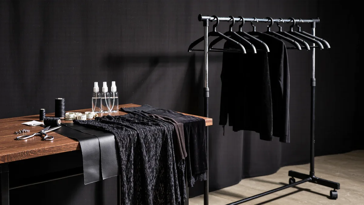
By weighting. A commercial palette is not a list of colors but a budget of them: a majority share of reliable commercial neutrals, a mid-share of seasonal colors that carry the trend story, and a small accent share where risk is concentrated. Design teams draw the seasonals from the published directions, then test them against the brand's own history — what its customer actually bought, which shades returned to the rack — and against production reality, because a color that cannot be dyed level on the required fabric, or that conflicts with a supplier's capacity, is edited out regardless of how well it photographs.
The result is a palette document with formal specifications — reference numbers, approved fabrics, per-fabric lab dips — that suppliers can quote against and that a color director can defend internally when the season's bets are questioned. In practice the document functions as the palette's contract: everyone who touches the season — design, buying, marketing, suppliers — signs onto the same weighted list, which is how a company with hundreds of styles arrives on the floor sounding like a single voice about color.
What can still go wrong in the two years?
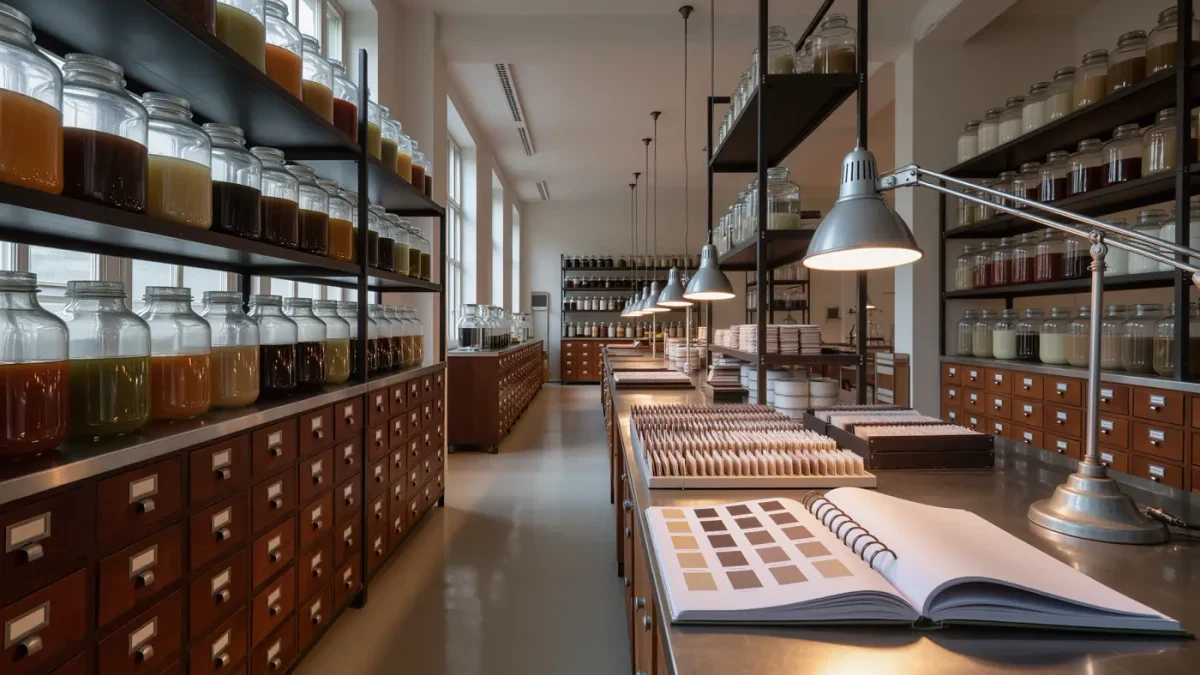
Nearly everything downstream of chemistry. Dyes behave differently across fibers; a shade that works on cotton may fail on synthetics or across a mill's water conditions, and lab dips go through several rounds before approval. Timing can slip, so a palette built for a season two years out can arrive into a mood that has moved — the pandemic demonstrated how fast a global event can invalidate a color plan, as retailers shipping into 2020 reported. And the accent share, where the trend risk lives, is where most misses concentrate — which is precisely why it is kept small.
The system's defense is the same at every stage: no single decision is allowed to be irreversible. Palettes are built to be weighted, hedged, and corrected — a portfolio of colors, managed like one. Two years out, that discipline is not conservatism; it is the only posture the lead time allows, and it is why the palette on a shop floor always looks more cautious than the palette in a forecast — deliberately, and by design. The boldness that customers eventually see was chosen early, tested chemically, weighted commercially, and defended in meetings no customer ever hears about.