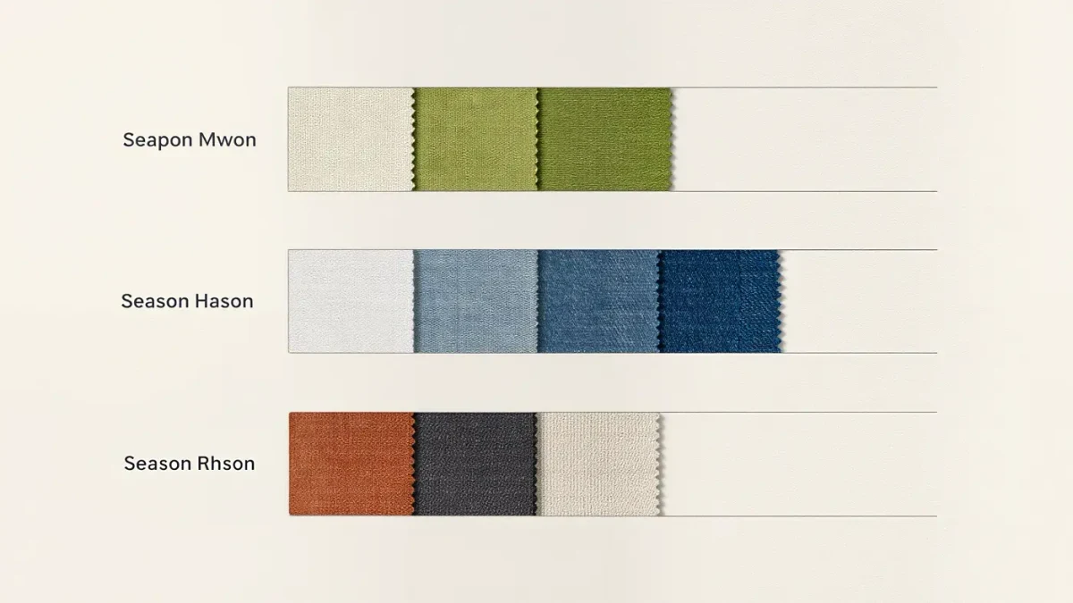
The color combinations that follow the season are built on one mechanism: contrast moves with the light. Spring pairs light tones with fresh mid-tones under strengthening sun; summer pairs light with lighter, low contrast, mirroring washed-out glare; autumn deepens everything and pairs mid-tones with rich darks; winter pairs dark with light at maximum contrast, like the season's own bare-branch palette. Read that way, seasonal dressing stops being a shopping instruction and becomes a light-matching exercise — and it works with clothes you already own.
Why Does Contrast Follow The Seasons At All?
Because color is read against ambient light, and ambient light changes measurably through the year. The low slanting light of autumn reads saturation warmly and flattens pale tones, which is why deep tones carry an autumn outfit while the same tones under June glare can look heavy. Summer's high sun bleaches surfaces and rewards low-contrast, light-adjacent pairings that would look washed out in January. Stylists have always dressed by this logic; color institutions formalize it — the Pantone Color Institute has built seasonal palettes on precisely the movement of light and mood for decades. The practical consequence is generous: a wardrobe does not need new clothes each season, only new adjacencies between existing ones.
Which Combinations Belong To Spring?
Fresh mids beside lights, with one warm anchor. Cream with grass green, oatmeal with cornflower blue, camel with pale butter yellow — pairs where neither partner is very dark and at least one carries green or blue's new-leaf register. Spring also tolerates the year's most optimistic adjacency: two mid-tones together, such as dusty pink with sage, which would vanish in winter light and sing in April. The season's one warning concerns whites: a blue-based optical white flatters against spring's light where a warm ecru can look tired, so the two whites should not be treated as interchangeable. Accessory metals follow the same fresh logic — silver and pale gold both read correctly from April onward.
What Pairs Carry Summer?
Light with lighter, plus salt-and-white anchors. White with faded denim blue, sand with pale olive, cream with soft coral — combinations whose contrast stays low because the season's glare does the sharpening. Summer is also the one season where head-to-toe neutrals in a single value — the all-linen ecru formula — reads intentional rather than unfinished, an effect impossible to replicate in February. The season's risk is muddiness rather than blandness: pale pairs require genuinely clean, undamaged fabric, because sun and wear show fastest in light tones, which is the practical reason summer capsules favor cottons and linens that launder hard.
Which Combinations Define Autumn?
Mid-tones against rich darks, warm-led. Rust with navy, olive with camel, burgundy with grey melange — pairs where at least one partner sits in the season's harvest register and the other provides depth without black's finality. Autumn rewards texture layering more than any other season, and texture changes color reading: the same burgundy moves toward wine in velvet, toward brick in brushed wool, which is why autumn outfits built from three textures of two colors out-perform outfits of five colors in flat weaves. The season's classic error is arriving too early — browns and rusts read heaviest before the light drops, so the palette deepens with the calendar, not with the shop floor.
What Makes Winter's Formula Different?
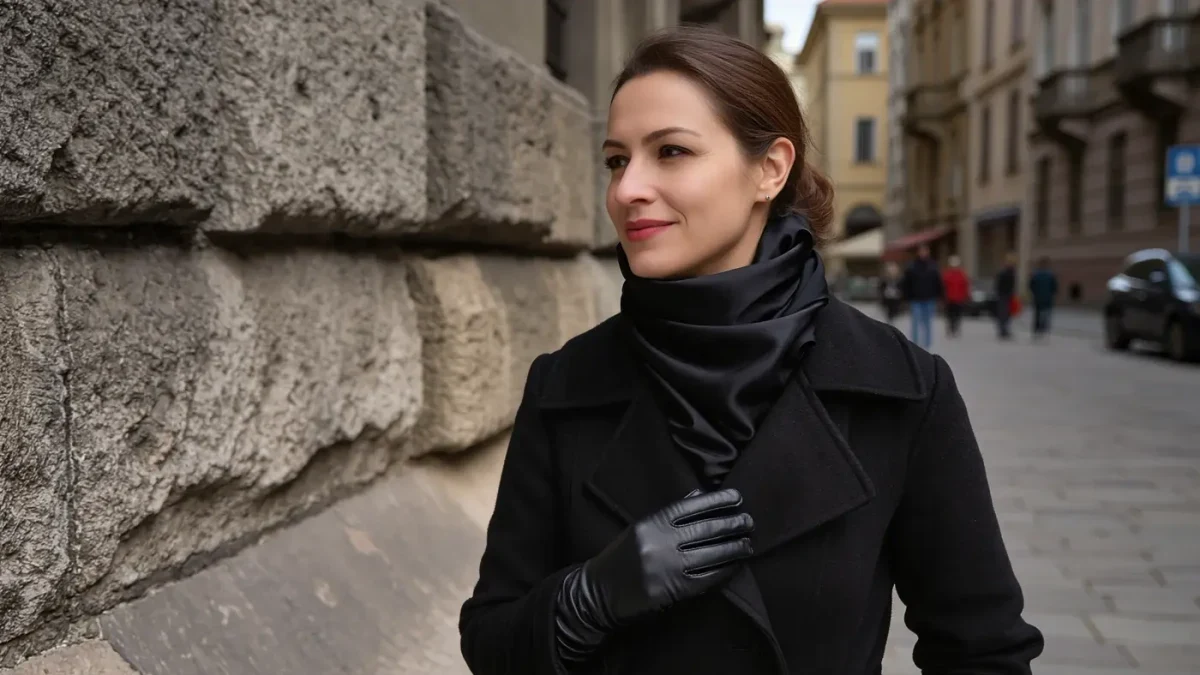
Maximum contrast, minimum count. Charcoal with ivory, black with camel, navy with cream — pairs built on the largest value gap in the wardrobe, mirroring a season whose own palette is dark wood, bare branch and snow light. Winter is the one season where black functions as a neutral base rather than a void, because pale winter daylight gives black edges and definition that indoor autumn light denies it. Accent colors follow jewel logic — emerald, garnet, sapphire read as depth against the high contrast, where the same shades in spring's context read as costume. One accent is enough; winter's contrast does the work two accents would otherwise share.
How Do You Match Seasonal Color To Your Own Coloring?
By borrowing the season's contrast level, not its exact shades. A naturally high-contrast dresser — dark hair, pale skin or the equivalent — translates winter's formula into any palette and should keep contrast high even in summer, through navy-and-white where ecru-on-cream would flatten. A low-contrast dresser does the reverse, keeping pairings within two values of each other in every season. Personal color systems have formalized versions of this for decades; the seasonal-light method needs none of their machinery, only a photograph in daylight and honest eyes. The shade is negotiable, the gap is not: matching your outfit's contrast to your own is what makes a color formula photograph as yours rather than as borrowed.
How Do You Apply This To A Wardrobe You Already Own?
As a quarterly pairing exercise, not a haul. Sort existing clothes into the season's contrast band, then photograph three pairings you have never worn together — the method's entire cost is an afternoon and a phone. Seasonal color commentary from institutions and forecast agencies, published with each season's palettes, then serves as confirmation rather than instruction: when a palette direction matches an adjacency already available in your closet, the pairing gets worn that season; when it does not, nothing is bought. Dressing this way, the seasons change the outfits while the wardrobe stays put — which is what following the season was always supposed to mean.