Every year, one color steps into the spotlight. It shows up on runways, in makeup aisles, and across design blogs before most people can even name it. The ritual behind that moment is more organized than it looks. It is part measurement, part theater, and it moves real money.
Here is who decides the Color of the Year, how the choice gets made, and why the title pays off. Readers following this should also see Who Invented Trend Forecasting, and When It Really Began.
The Meeting Behind the Swatch
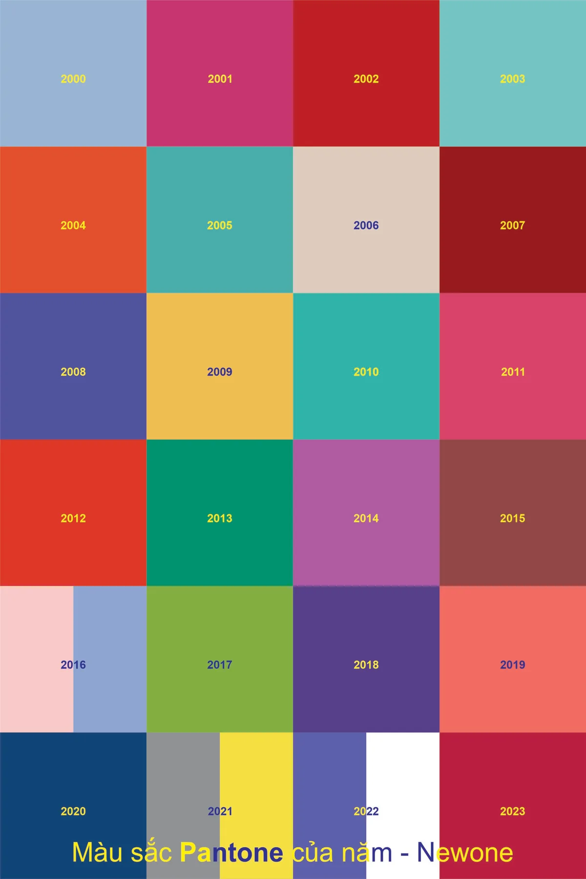
Since 2000, the Pantone Color Institute has declared a particular color "Color of the Year." The pick does not come from one designer's mood board. As Wikipedia's entry on Pantone explains, twice a year the company hosts a secret meeting in a European capital. The guests are representatives from various nations' color standards groups. After two days of presentations and debate, they choose a color for the following year. The color for summer 2013, for example, was chosen in London in the spring of 2012.
Secrecy is part of the machinery. The reveal lands on a set date. The announcement itself becomes news, which is exactly the point.
Reading the Zeitgeist
The chosen color purportedly connects with the zeitgeist, the spirit of the moment. When Honeysuckle was named the color of 2011, the press release said: "In times of stress, we need something to lift our spirits. Honeysuckle is a captivating, stimulating color that gets the adrenaline going." This is forecasting as storytelling. A shade comes with a reason the world supposedly needs it now.
Leatrice Eiseman, executive director of the Pantone Color Institute, has described her method in interviews. She looks, in her words, for "ascending color trends, colors that are being used in broader ways and broader context than before." The winner is not a wild guess. It is a pattern spotted early and promoted loudly. We covered a connected angle in How WGSN Spots Movements Before They Have a Name.
From Forecast to Store Shelf
The payoff begins after the reveal. The results of the meeting are published in Pantone View. Fashion designers, florists, and many consumer companies buy it to guide their designs and plan future products. A color chosen in a closed room ends up steering palettes across whole industries.
Direct collaborations follow. In 2012, the Color of the Year, Tangerine Tango, became a makeup line in partnership with Sephora. The collection included lashes, nail lacquers, and lip gloss built around the shade. Twice, in 2016 and 2021, Pantone chose two colors for the year. A single shade could not carry those moments alone.
Why Brands Play Along
The commercial logic is simple. A named color arrives with its own publicity cycle. A brand that designs into that shade borrows the momentum. Products timed to the announcement ride a story that writers are already set to tell. For trend-driven fields, joining the forecast costs less than fighting it.
There is also a halo of authority. When a respected color body crowns a shade, choosing it feels smart rather than random. That quiet sense of backing helps designers defend their picks to clients.
How to Use It at Home
Home decorators can borrow the habit on a small scale. The annual shade makes a low-risk accent: pillows, vases, or a wall of paint that is easy to change. Design media treat the color as a starting point, not a rule. Pairing it with neutral tones keeps a room current without a full remodel.
The point is not obedience to a forecast. It is a nudge toward fresh choices with a story attached. One crowned shade, used sparingly, can do that.
Conclusion: One Color, Many Payoffs
The Color of the Year is part measurement, part theater. A private meeting watches what the world already reaches for. It crowns one shade and hands industries a calendar to design against. The next time a single color seems to be everywhere, you are not imagining it. Someone chose it, and many companies bet you would follow.